Websites are now being accessed all over the world from a wide range of different devices and it has never been more important to ensure you are providing an exceptional user experience. Which is why we have put together this list website UX checklist of 25 usability tips that will help to improve your conversion rate.
The smallest on-site factors could be the difference between a user spending 20 mins on your site or clicking the back button within the first few seconds. Keeping your visitors happy and providing a good user experience is vital and everything from the design to the structure of your site should cater to their needs and expectations.
The Identify Web Design team have seen a lot of standard top 10 lists knocking around for usability but there are far more factors involved than that so we have used this experience to compile this UX checklist to help you when designing or optimising your website:
- Intuitive user journeyLike any journey, the progression through your website may involve several steps and these steps should be logical and intuitive. The user should be able to find all the information they need easily by being able to easily navigate to different pages on the site and if there are specific actions you want them to take, you should make them obvious too.
- SimplicityCluttered websites can be very off-putting and confusing for your visitors. a simpler design is both more aesthetically pleasing and more likely to convert. As well as a clean, non-messy appearance having key elements in logical places is also highly beneficial, you want to find a good balance between a clean design and making sure key CTAs are present.
- Don’t annoy your user with ads and pop upsYou would think this would be a fairly obvious one but there are still many websites that have intrusive adverts and pop-ups that may annoy people so much that they leave your site and don’t come back. Of course, many websites rely on adverts to monetize their sites but the use of intrusive adverts or pop-ups should be tested to check the effects on conversion rate and then adapted accordingly.
- Design for all devices
 Having a responsive website is essential now but as well as having your site set up to display on a variety of different screen shapes and sizes it is also important to test the design and usability on the different screens and to make design changes from a mobile first perspective. Too many times on a project a website is made responsive but not tested thoroughly on all possible devices, screen sizes and browsers. No modern day user experience checklist would be complete with out considering this one.
 - Make it obvious what your website doesOn often a forgotten UX tip. Some visitors to your site will know exactly what it is for but some will not have a clue and it is important to let them know as soon as they land on one of the pages. A tagline or something in the header can give people a quick idea of the general purpose of the website and there should be some text to describe the purpose of the site in core detail, often this can be on an about us page but it also important that individual pages inform the user what the purpose of that page is via body text, headings and images.
- Key content above the foldMake sure your most important on-page content is above the fold (the section of the page that is visible on a screen upon first landing on that page). Key content will be different depending on what type of website you have, if it is a product page on an e-commerce store then you might want to have some products above the fold if it is a blog you may want the beginner of the text above the fold to try and entice people into reading.
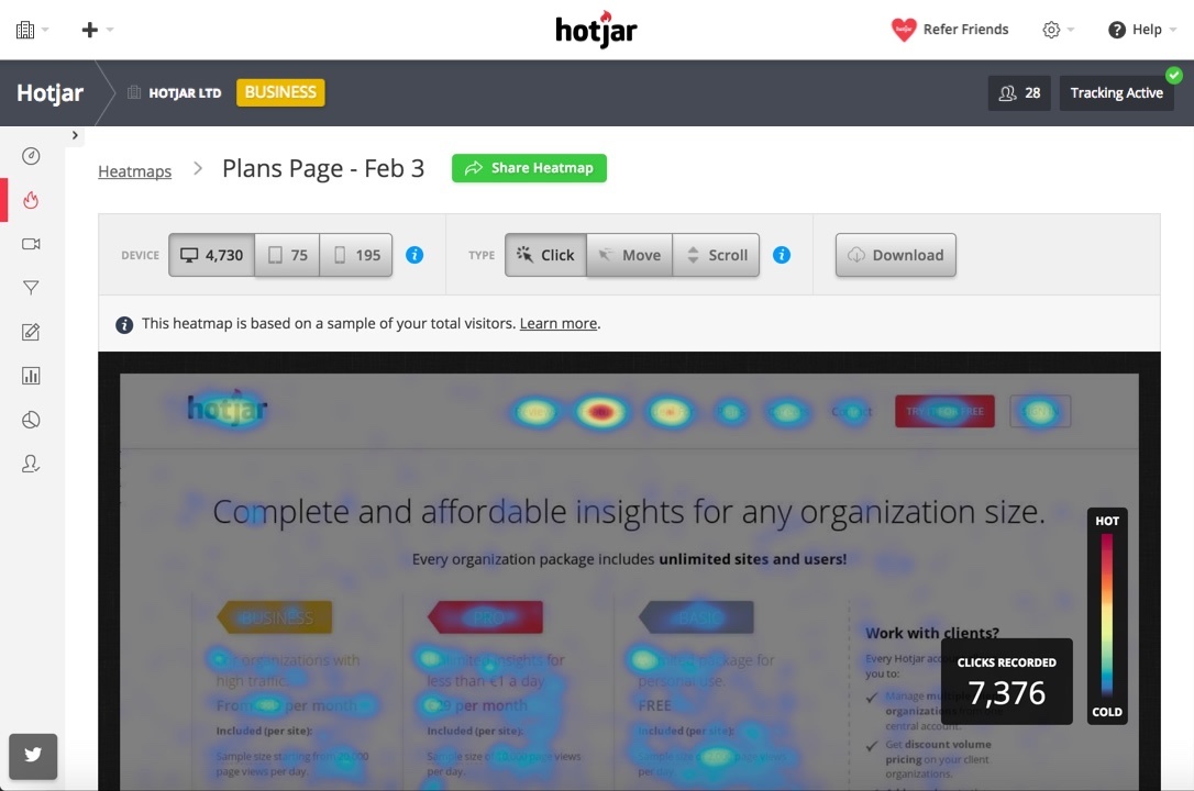
- Heat mapping
 We can never know the exact behaviour of every one of our website’s visitors, so the more data that we can collect the better. Heatmaps are a great way to collect this data and feed us info about the actions being taken on our web pages which we can then use to make informed decisions about design, UX and CTAs. We can recommend Hotjar for your heatmapping needs.
 - Obvious navigationThe whole point of the navigation is to help your users to find exactly what they are looking for so make it easy for them by making it well organised and logical. All your most important pages should be accessible from the main navigation and any inner pages should be accessible from these pages. This is usability 101.
- Intelligent use of colour
 First of all, make sure that the colours on your website complement each other so people will not be put off. Secondly, the psychology of colour can be a powerful asset in terms of increasing conversions, this is something that can be tested until you are using the optimal colours for important elements such as CTAs.
 - Fast page load timesA slow loading website is a sure fire way to make visitors leave your site and to negatively affect conversion rates with studies showing that nearly half of people expect a web page to load in under 2 seconds. Thankfully it is now fairly easy to improve your page speed, this guide will help.
- Attractive fontsWhich fonts you use can make a big difference, one aspect is some fonts are just more attractive than others but there is also an issue with readability with some fonts being far easier to read than others which may directly influence how much of your copy a person is willing to read. This reader usability tip can really help with getting people to stick on a web page for longer.
- Internal linkingA good internal linking set up makes to easier for the user to navigate your website and find what they are looking for. If there is a relevant place in your copy to divert them to other pages (perhaps with a more commercial intent) then take that opportunity and add in an internal link. This can also help to improve your websites bounce rate.
- Site searchFor larger sites, an internal site search function is a must. Again this relates back to the aim of making it easy for people to find what they are looking for on your site and it can often be the first stop for people who don’t want to spend time looking around the website to find what they want.
- Useful 404 page
 It is bad enough for a user to land on a page that does not exist or has moved but if they are also presented with an unhelpful message and no suggestions of what to do next it can be an even more frustrating experience. Make sure you clearly explain on your 404 page what has happened and present some options such as going back to the homepage or links to other relevant pages on the site. A simple UX tip that really makes a difference.
 - Minimise stepsTry to analyse all the different actions a user might take on your website and make sure they can complete these actions in the least amount of steps (or clicks) as possible. If there are unnecessary steps remove them.
- Well formatted textBreaking up text into smaller paragraphs and with subheadings can make it look less daunting to read, large blocks of text can put people off. Bullet points and images are also great for breaking up the text.
- Engaging copyThere is nothing worse than reading dry, uninspiring or just plain boring copy.It’s even worse if you are faced with a huge block of text that may well contain the information you require but it is hidden away in a wall of tedium. Engaging copy at the beginning of the page is especially important in enticing the reader in and then the rest of the text must maintain their interest for as long as possible (preferably to the end!).
- Images & videosSimilarly, to a well-formatted page, in the digital world using images and videos can help to break up text and make a web page more appealing and improve engagement rates. They can also help to enhance the text by supplying further information. In the case of video, engagement can be improved even further as visitors stop to watch and further CTAs could be included within the video.
- Prominent CTAsCall to actions (CTAs) are one of the most important elements of any website. You want your user t click that link or button, buy something, download something, watch a video or sign up for your mailing list. You need to make sure that these CTAs are in highly obvious places and stand out, with persuasive factors to encourage the people to click on them or take the action you want them to.
- Grammar & SpellingThe spelling and grammar police are everywhere these days and with good reason! But seriously, you cannot expect people to take your business seriously if there are grammatical errors all over the place. To convert your visitors, you need to build trust and confidence which will be severely dented if your copy looks like it was written by a 5-year-old. You should make sure to spell check all text before putting it live and even invest in a high-end program like Grammarly to check your copy. Improving reader usability is key.
- Use breadcrumb navigationBreadcrumb navigation serves two important purposes in terms of UX, it lets the user know where in the website hierarchy they currently are and allows them to easily navigate to other relevant pages on the site. Both can increase the time someone spends on your site and help confusion levels, both of which make for a solid user experience.
- Homepage link from the logoThis has just become the standard on all websites these days and it is the natural place people go to if they want to get back to the home page from any location on a website. Even your Gran knows this so it is essential to add the link in.
- A/B TestingThis is proabably the signle most important thing on any UX checklist. There are many well-known sayings about making assumptions and this could not be any truer for websites and, in particular, the way people interact with your site. We can never say with 100% accuracy what someone is thinking when using your site but we can use a data-led approach to finding what works and what doesn’t. A/B testing is now a vital part of CRO and is a powerful weapon.If you are not familiar with it, it basically involves running experiments with 2 different variables on your website (e.g. two different button colours) and seeing which one performs the best. The winner is then the one you use on the site. This is probably the number 1 of all the usability tips simply because your visitors tell you what they prefer.
- Ask the audienceThere is no better way to find out what your audience like that no just simply ask them. Real feedback from the people who use your website is more powerful than any data you can collect. You can conduct surveys to find out how people feel about certain elements of the site or you can go one step further can actually get in touch with them and ask them. Of course, any findings can be implemented accordingly.
- MaintenanceOnce you have all the other elements of your website in pace and it is set up to maximise engagement and conversions it is vital to keep a close eye on the general health of the site. Look for any errors, broken links, things that have stopped working and generally anything that could negatively impact the user experience.You can check Google Search Console and Google analytics to check for onsite technical problems and also listening to feedback from your users is always a good idea.